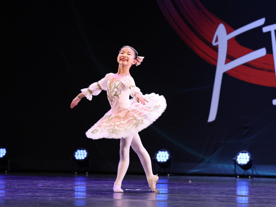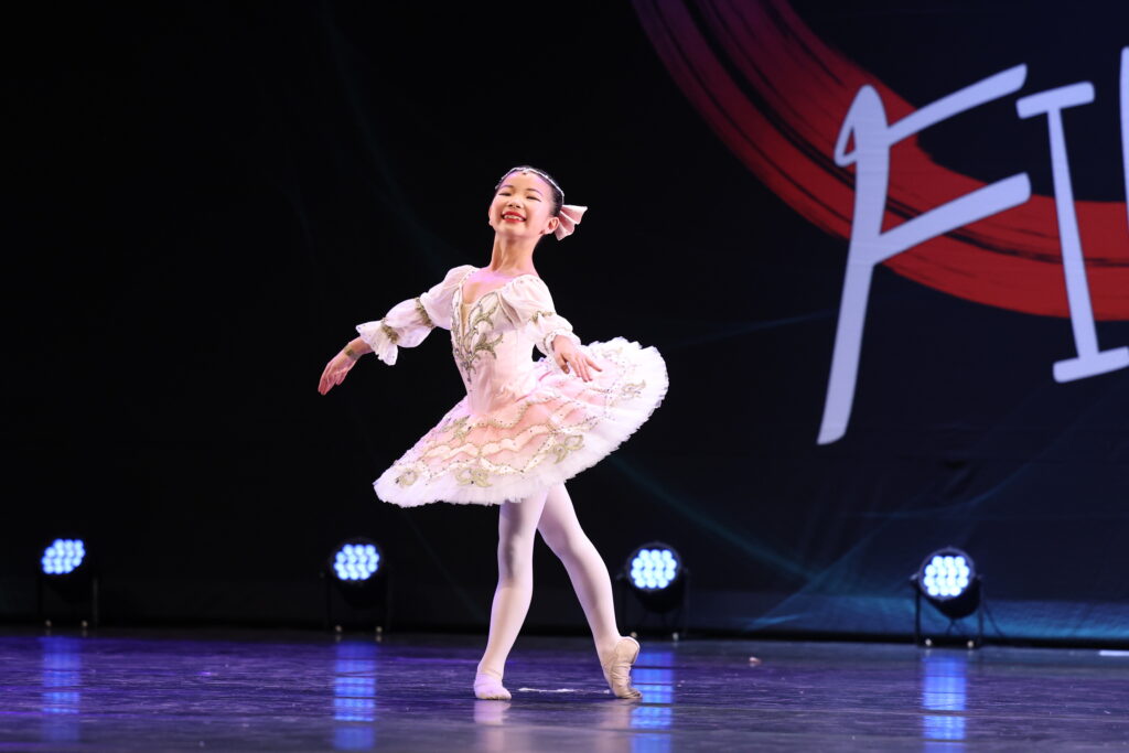

Meet our Dancers of the Year 2026!
8. September 2026
A logo is more than just a visual mark. It represents identity, values and the story behind a brand. For Dance Unit, one of the most important elements of this identity is the circle.
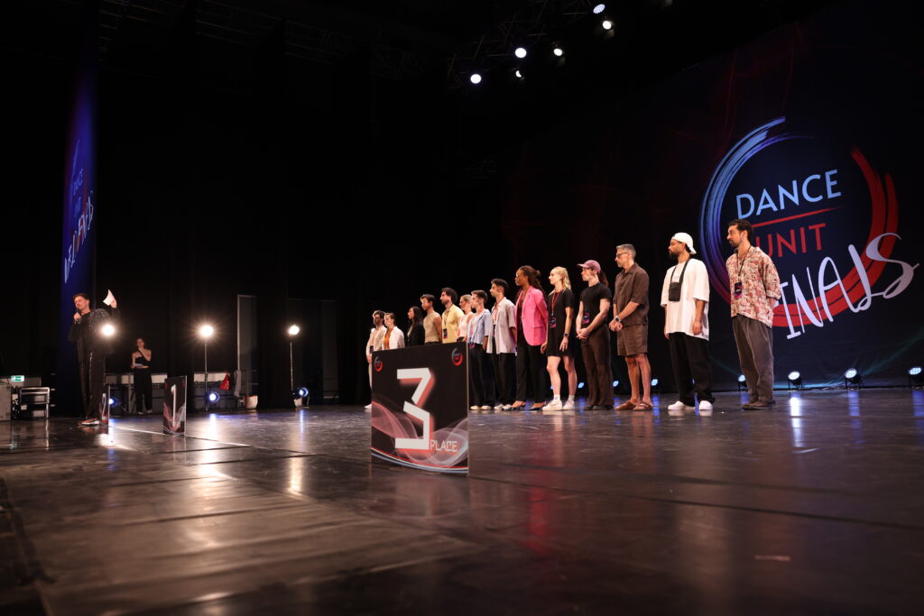
At first glance, the Dance Unit logo may seem simple: a dynamic circular shape surrounding the words DANCE UNIT. But the circle carries a deeper meaning. It represents movement, connection, continuity and unity – values that are at the heart of Dance Unit.
The Circle – A Symbol of Connection
Blue, Red and Everything in Between
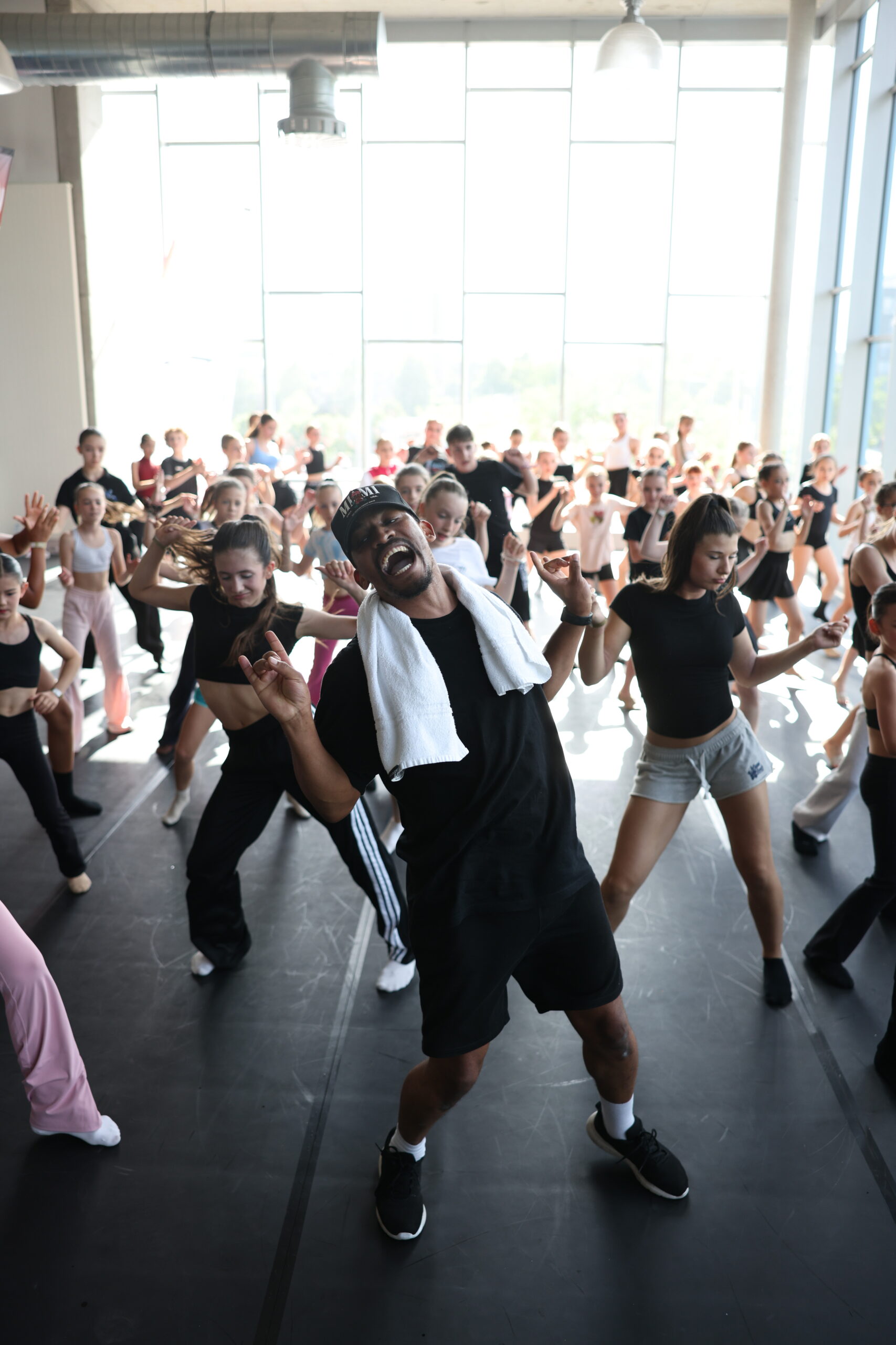
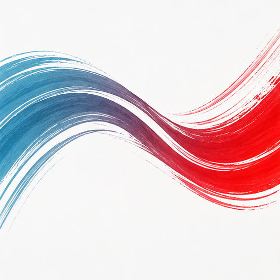
The transition from blue to red creates a strong contrast while keeping the entire circle connected. The colours can evoke different qualities – from calmness and clarity to energy, passion and determination.
Together, they represent the different energies that come together in dance and the constant process of change and development that every dancer experiences.

A Logo That Reflects the Dance Journey
There is something especially fitting about a circle having no real beginning or end. A dancer's journey works in much the same way. There is always a new choreography to learn, another stage to step onto and another goal to reach.
Over time, the Dance Unit logo has become more than just a visual identity. It has become a symbol of the community, the stages, the competitions and the many dancers who are part of the Dance Unit journey.
Always moving. Always evolving. Always connected.
Because at Dance Unit, the circle is more than a shape.
It is a symbol of the journey we share through dance.